Segmentation within Scheduling!
Generally, non-commercial channels such as the BBC do not have the time between programmes that advertisements have to provide for commercial channels such as ITV and Channel 4.
Idents add time between programmes generally for the following reasons;
- To provide relevant information.
- To promote a variety of programming.
- To regulate the scheduling to fill time.
- To provide a break for studio workers such as News and Sports.
With segmentation within scheduling, this is generally the grouping of an individual ident between a programme. For example with MTV Hits idents being aired, then a programme would follow and once it has finished MTV Hits ident would then be aired once again. This generally means that it puts the schedule into different segments. The overall idea of the segmentation within scheduling would stem from the film industry. With the opening titles these tend to often be the names of the production as well as the distribution companies, followed by the actors who were in the film as well as the director. However, at the very end of the film the credits would roll of all individuals who had taken part within the production. Due to the same ident being played consistently before and after a show/ film, due to this it generally reinforces the overall channel's identity as well as making it clear at the same time to the audience exactly what channel in which they are watching.
Thursday, 29 June 2017

Purpose: Scheduling
Scheduling!
Generally, an ident is there to play an important role when it comes to keeping scheduling for a channel organised. In terms of audiences, an ident is an ideal opportunity which provides their audiences with sufficient important and key information about programme scheduling for that individual channel. This information may perhaps entice the viewer to want to continue watching from that particular channel rather than choosing to swap over to another channel. Going into depth with a scheduling tool which is known as 'Stacking' this places two of the same or even similar shows on after another. With this an ident would generally be there to inform the audience of this which would therefore potentially maintain the audience flow.
Sometimes TV idents are sometimes aired during the period of time in which an advert is aired. This is a very effective use of scheduling due to it emphasising the channel as well as keeping the channel in the viewer's mind. This would generally be reminding them of the brand and it's overall identity.
An ident for E4 would be the beach which this I felt it clearly represents summer and is quite generally natural, which often is often shown during this time of year as it is coming up to summer. You can see that with the ident it is based around a sunny day at a beach, which would also indicate that obviously the ident is shown during the day.
With the design however, in terms of colours, objects, movement and overall space I feel this suggests a certain tone, which would generally be fun, bright and potentially exciting. I feel this that is a perfect example of a careful consideration for the actual scheduling in which of the ident and it results in a much higher quality audience interaction due to the fact that there is an identifiable link between when the ident is being broadcasted and generally at what time of day and year. With this, the same could be said for Channel 4's Tokyo ident back in the day which was set at night in the capital city. This would create a subdued tone and as a viewer of Channel 4 myself, I can clearly see from research that this ident back in the day and was broadcasted in the evenings. Generally, this would be an accurate indication in terms of times, whether day or night and when it is being broadcasted.
Generally, an ident is there to play an important role when it comes to keeping scheduling for a channel organised. In terms of audiences, an ident is an ideal opportunity which provides their audiences with sufficient important and key information about programme scheduling for that individual channel. This information may perhaps entice the viewer to want to continue watching from that particular channel rather than choosing to swap over to another channel. Going into depth with a scheduling tool which is known as 'Stacking' this places two of the same or even similar shows on after another. With this an ident would generally be there to inform the audience of this which would therefore potentially maintain the audience flow.
Sometimes TV idents are sometimes aired during the period of time in which an advert is aired. This is a very effective use of scheduling due to it emphasising the channel as well as keeping the channel in the viewer's mind. This would generally be reminding them of the brand and it's overall identity.
An ident for E4 would be the beach which this I felt it clearly represents summer and is quite generally natural, which often is often shown during this time of year as it is coming up to summer. You can see that with the ident it is based around a sunny day at a beach, which would also indicate that obviously the ident is shown during the day.
With the design however, in terms of colours, objects, movement and overall space I feel this suggests a certain tone, which would generally be fun, bright and potentially exciting. I feel this that is a perfect example of a careful consideration for the actual scheduling in which of the ident and it results in a much higher quality audience interaction due to the fact that there is an identifiable link between when the ident is being broadcasted and generally at what time of day and year. With this, the same could be said for Channel 4's Tokyo ident back in the day which was set at night in the capital city. This would create a subdued tone and as a viewer of Channel 4 myself, I can clearly see from research that this ident back in the day and was broadcasted in the evenings. Generally, this would be an accurate indication in terms of times, whether day or night and when it is being broadcasted.
Purpose: Packaging and Re-Packaging
Packaging and Re-Packaging!
Idents generally serve as somewhat an anchor which contains meaning which reflects their ethos, BBC mostly reflects their ethos. BBC most recently changed their idents whcih were used to reflect their fourth and new ethos of overall celebrating cultural diversity. They responded to this change by directly changing by repacking their idents away from their circular branding to spaced within the UK in which celebrates diversity.
The overall concept when looking at packing and repackaging is generally the evolution of re-designing idents from the same channel while still maintaining a sense of the same corporation identity and general theme, but with a change in brand identity and possible characteristics in which the channel felt would better appeal to their audiences.
Re-brands tend to be quite dependent on their viewing figures. For example if the statistic were low, a channel would generally choose to want to expand their target audience and for this would require to make alterations to the actual brand. However, this would not affect the overall brand loyalty if changes were enabled the current audience would still be able to decipher that the channel is still the same through the actual ident.
Another channel (ITV) had a re-branding and it took place in the overall attempt to be able to appeal to a younger range in terms of audience. This would be evident through the use of typography which would generally appeal due to it being curly and swirly. Which overall to me would suggest a casual, informed tone and one which would be associated with the age category of teenagers as well as younger adults. The technique with the colours as well suggest that the graphic designers had changed the colours of the logo according to the colour scheme of the programme being broadcasted. Due to the overall fact that ITV airs a diverse range of programmes I feel that this is a clever and well used technique. The overall re-branding of the logo had made it more visually appealing for its audiences.
 Old logo
 New logo
When comparing the logos, with the old being yellow and black with the straight-edged typography of the logo, I personally feel that this is a very professional and corporate tone. Which overall reflects the previous target audience of mainly adults as well as older audiences in general. With the new logo being more colourful which I feel generally reflects and attracts younger audiences to bright colours as I personally would rather be looking at something with more than just two colours which was what was incorporated within the old logo.
Idents generally serve as somewhat an anchor which contains meaning which reflects their ethos, BBC mostly reflects their ethos. BBC most recently changed their idents whcih were used to reflect their fourth and new ethos of overall celebrating cultural diversity. They responded to this change by directly changing by repacking their idents away from their circular branding to spaced within the UK in which celebrates diversity.
The overall concept when looking at packing and repackaging is generally the evolution of re-designing idents from the same channel while still maintaining a sense of the same corporation identity and general theme, but with a change in brand identity and possible characteristics in which the channel felt would better appeal to their audiences.
Re-brands tend to be quite dependent on their viewing figures. For example if the statistic were low, a channel would generally choose to want to expand their target audience and for this would require to make alterations to the actual brand. However, this would not affect the overall brand loyalty if changes were enabled the current audience would still be able to decipher that the channel is still the same through the actual ident.
Another channel (ITV) had a re-branding and it took place in the overall attempt to be able to appeal to a younger range in terms of audience. This would be evident through the use of typography which would generally appeal due to it being curly and swirly. Which overall to me would suggest a casual, informed tone and one which would be associated with the age category of teenagers as well as younger adults. The technique with the colours as well suggest that the graphic designers had changed the colours of the logo according to the colour scheme of the programme being broadcasted. Due to the overall fact that ITV airs a diverse range of programmes I feel that this is a clever and well used technique. The overall re-branding of the logo had made it more visually appealing for its audiences.
Old logo New logoWhen comparing the logos, with the old being yellow and black with the straight-edged typography of the logo, I personally feel that this is a very professional and corporate tone. Which overall reflects the previous target audience of mainly adults as well as older audiences in general. With the new logo being more colourful which I feel generally reflects and attracts younger audiences to bright colours as I personally would rather be looking at something with more than just two colours which was what was incorporated within the old logo.
Purpose: Marketing
Marketing!
 In general sense, marketing is the overall study and management of exchange in relationships. Promotion, marketing since within this as idents are serving as a method of promotion both the channel but also acting as a service and the goods which it would sell. With a successful ident, this would generally help with the promotion of an individual programme. An example of this would be E4's Eefer is generally quite a smart and practical way of marketing The Big Bang Theory, which is known as E4's most popular show. The reason behind this is generally due to the fact that they are utilising the overall themes of robotics which are seen in The Big Bang Theory within the ident itself. The clear attempt of synergy had been made even clearer given the fact that the robot was first shown to the audience along with the release of The Big Bang Theory on E4.
Idents can generally be useful as a marketing tool if a channel were to consistently promote a new show or even a returning series. A good example of this would be Channel 4's idents which are for the Simpsons. Channel 4 would/ could release a new ident with the theme of The Simpsons everytime a new season were to be released.
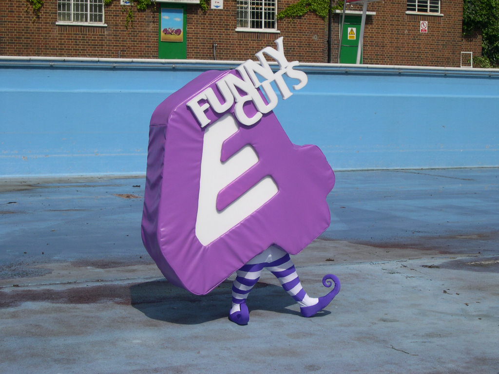 In general sense, marketing is the overall study and management of exchange in relationships. Promotion, marketing since within this as idents are serving as a method of promotion both the channel but also acting as a service and the goods which it would sell. With a successful ident, this would generally help with the promotion of an individual programme. An example of this would be E4's Eefer is generally quite a smart and practical way of marketing The Big Bang Theory, which is known as E4's most popular show. The reason behind this is generally due to the fact that they are utilising the overall themes of robotics which are seen in The Big Bang Theory within the ident itself. The clear attempt of synergy had been made even clearer given the fact that the robot was first shown to the audience along with the release of The Big Bang Theory on E4.
 Idents can generally be useful as a marketing tool if a channel were to consistently promote a new show or even a returning series. A good example of this would be Channel 4's idents which are for the Simpsons. Channel 4 would/ could release a new ident with the theme of The Simpsons everytime a new season were to be released.
Purpose: Branding
Branding!
A companies overall ethos and aims can general reflect on it idents. With a brand it would generally allow a channel's target audience to be able to associate with any programmes to that channel, especially if the ident is to be consistently played.
 This doesn't just tend to just be a visual experience. The sound of TV Idents can also generally help with the build of the identification with a channel who would be popular as it would generally help with their branding. With sound this would work and be good for branding as if perhaps your favourite show was to start, mine being 'The Vampire Diaries', if I was to hear the comforting signal of it showing I would be straight there, it is a comforting signal which allows you to be aware if your favourite show is on. A successful campaign would run alongside a series of idents which would generally continue that companies ethos as well as ideology. Branding is a really strong technique which is used within businesses and it is generally used to direct the link within recognition of audiences in the choice of colour, style and overall purpose. Meaning that in someway, the link can be relevant to the audience and generally have a connection.
A companies overall ethos and aims can general reflect on it idents. With a brand it would generally allow a channel's target audience to be able to associate with any programmes to that channel, especially if the ident is to be consistently played.
 This doesn't just tend to just be a visual experience. The sound of TV Idents can also generally help with the build of the identification with a channel who would be popular as it would generally help with their branding. With sound this would work and be good for branding as if perhaps your favourite show was to start, mine being 'The Vampire Diaries', if I was to hear the comforting signal of it showing I would be straight there, it is a comforting signal which allows you to be aware if your favourite show is on. A successful campaign would run alongside a series of idents which would generally continue that companies ethos as well as ideology. Branding is a really strong technique which is used within businesses and it is generally used to direct the link within recognition of audiences in the choice of colour, style and overall purpose. Meaning that in someway, the link can be relevant to the audience and generally have a connection.
Purpose: Identity
Identity!
It is generally essential for any media company/companies to be able to stand out from their competitors, therefore with creating a unique idea for an identity would portray everything about the company. For example it's aims as well as values, also by representing its target audience and perhaps some potential hobbies.
BBC:
Looking at BBC One and how they identify themselves, they have released a new on-screen identity based around the actual symbol of a circle. The reason behind this was done, Peter Fincham who was the controller had said that "In an increasingly competitive marketplace a channel needs to stand out from the crowd and I believe our new identity is just what's needed for BBC ONE".
The new channel identity had launched on air in the morning of the 7th of October 2006, which was a Saturday. The on-screen presentation had also been changed to be able to reflect the overall circle concept. The circle is generally what is there to set the heart of the campaign, this has been familiar among BBC One viewers over the several years, but this is generally modern, forward looking and something different overall which is surprising.
Here are a few examples of BBC One's circle idents:


It is generally essential for any media company/companies to be able to stand out from their competitors, therefore with creating a unique idea for an identity would portray everything about the company. For example it's aims as well as values, also by representing its target audience and perhaps some potential hobbies.
BBC:
Looking at BBC One and how they identify themselves, they have released a new on-screen identity based around the actual symbol of a circle. The reason behind this was done, Peter Fincham who was the controller had said that "In an increasingly competitive marketplace a channel needs to stand out from the crowd and I believe our new identity is just what's needed for BBC ONE".
The new channel identity had launched on air in the morning of the 7th of October 2006, which was a Saturday. The on-screen presentation had also been changed to be able to reflect the overall circle concept. The circle is generally what is there to set the heart of the campaign, this has been familiar among BBC One viewers over the several years, but this is generally modern, forward looking and something different overall which is surprising.
Here are a few examples of BBC One's circle idents:
Design - Entertainment Led
Entertainment Led!
Some idents are generally just made for full entertainment purposes.
ITV:
ITV are a commercial channel therefore their ethos tends to lean towards entertainment we can see this being replicated in their tv idents where we can see their pug being washed in the kitchen sink with no voice over was generally served just for entertainment. With this I feel that ITV's approach is generally that who doesn't like cute dogs, also fitting with their target audiences who would generally own a pug or a dog alike who would be sitting on their laps watching the show to come with them.
Some idents are generally just made for full entertainment purposes.
ITV:
ITV are a commercial channel therefore their ethos tends to lean towards entertainment we can see this being replicated in their tv idents where we can see their pug being washed in the kitchen sink with no voice over was generally served just for entertainment. With this I feel that ITV's approach is generally that who doesn't like cute dogs, also fitting with their target audiences who would generally own a pug or a dog alike who would be sitting on their laps watching the show to come with them.
Subscribe to:
Posts (Atom)
Limitations: Analogue, Digital Recording and Transmission Systems
Analogue, Digital Recording and Transmission Systems! Chandler, D & Munday , R. 2011. A Dictionary of Media and Communication. Oxf...

-
Creation of Corporate Identity! What is this? When looking at what a corporate identity or corporate image is, I had found that it gener...
-
Size! When you're creating an ident it is generally a good idea to think about the overall dimensions which are within video screens. ...
-
Display of Text-based Information! With this having a clear opportunity of on-screen representation is generally having the ability of bei...


